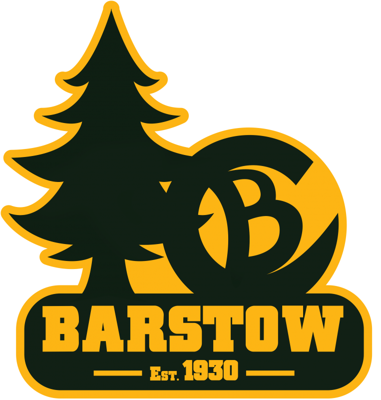
Last summer some of our Camp Staff members were feeling the excitement around camp and worked to come up with a Barstow “brand”. They wanted a simple logo that could easily be recognizable and actually turned into a hot iron brand like Scouts see at Philmont. With the generational gap between the Gen X camp leadership and these earnest youth I’m not sure we all agreed on what the new design should look like. We needed a simple maybe 1 or 2 color design that could fill the gap between our splashy new action logo featuring the waterfront.


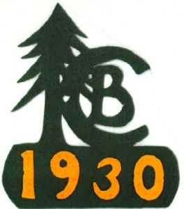
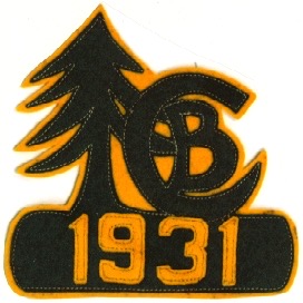
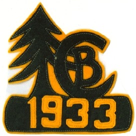
 I reached out to Jason Shull who is one of the handful of real historians of Scouting history in the area. He was able to provide me with some nice scans of the earliest Camp Barstow patches to use for inspiration. I was looking for something that was classic, easily represented the camp, and would be timeless. Based on the first camp patches in 1930 and 1931 and 1933 I commissioned a graphic artist to bring a new brand to life.
My test audience was the camping committee of the Indian Waters Council. At this weeks meeting I showed them the design and got a thumbs up. Going forward I hope we can use this brand much like other camps do. I’ve seen several camps that have a different patch design every year yet still have a classic brand that Scouts can identify.
What do you think? Please leave comments to this blog post below!


Darrin Luksik says:
I really do love the Pine Tree and classic feel. However, Camp Barstow is now at it’s third location. The waterfront and access to lake Murray, which is such a strong suit for IWC’s camp, isn’t promoted with a retro design. If re-branding, should that showcase feature be identifiable somehow? YiS,
Lorie McGraw says:
Is there any way to add a FDL to it to show that it is a Scout camp?
Art Seel says:
Look great Jason, I like it!
Tom Wirzburger says:
I’m as old school as they come. I love classic Scout in all shapes and forms and cling to the past like mildew on a tent. However, I tend to agree with Darrin. I don’t see anything that even hints at the waterfront which is Barstow’s identity today.
Jeffrey Cook says:
I love the classic felt look. And no matter what design you use you cannot please everyone. I for one am tired of the nautical theme to everyrhing since moving to Lake Murray.